Do school districts spend less money on poor and minority students?
Showing posts with label Economics. Show all posts
Showing posts with label Economics. Show all posts
Monday, January 4, 2021
Monday, June 25, 2018
Friday, May 11, 2018
Tuesday, March 20, 2018
Monday, March 19, 2018
Tanzania’s rogue president
"Since coming to power in the country of 55m on the east coast of Africa in 2015, Mr Magufuli, nicknamed “the bulldozer” from his time as roads minister, has bashed foreign-owned businesses with impossible tax demands, ordered pregnant girls to be kicked out of school, shut down newspapers and locked up “immoral” musicians who criticise him. A journalist and opposition party members have disappeared, political rallies have been banned and mutilated bodies have washed up on the shores of Coco Beach in Dar es Salaam, the commercial capital. Mr Magufuli is fast transforming Tanzania from a flawed democracy into one of Africa’s more brutal dictatorships. It is a lesson in how easily weak institutions can be hijacked and how quickly democratic progress can be undone."
Economist: Tanzania’s rogue president
Tuesday, March 13, 2018
Heaven on Earth: The Rise and Fall of Socialism
Heaven on Earth: The Rise and Fall of Socialism (2005) is a three-hour PBS documentary film.
Monday, February 13, 2017
Paul Krugman's myopic market prediction
I'm not a fan of Paul Krugman. His political bias keeps him from making objective economic analysis but in truth, it's his arrogance and smug attitude that makes me really dislike the guy. As such, I've really enjoyed seeing him eat a little crow regarding his 11/09/16 New York Times blog post. Written the day after Trump was elected president, with the Dow closing at 18,332.74, he said:
I have no idea whether or not the market will remain strong. Given Trump's somewhat anti-free trade noise I'm a little skeptical. Regardless, it's nice to see Krugman quickly proven so completely wrong.
"If the question is when markets will recover, a first-pass answer is never...So we are very probably looking at a global recession, with no end in sight. I suppose we could get lucky somehow. But on economics, as on everything else, a terrible thing has just happened."It didn't take long for Krugman to be proven wrong as the very next day the Dow closed at 18,589.69. Two weeks after the election it closed above 19,000 for the first time in its 120 year history. Then on January 25th it broke above 20,000. As of right now it is at 20,380.81.
I have no idea whether or not the market will remain strong. Given Trump's somewhat anti-free trade noise I'm a little skeptical. Regardless, it's nice to see Krugman quickly proven so completely wrong.
Wednesday, June 25, 2014
The Price of Education (revisited)
Back in 2011 I wrote blog entry on how the average cost of a four year degree had tripled in inflation adjusted dollars from 1980 to 2010. So has there been any change in the three years since? For the most part, not really.
The following table from collegeboard.org provides the average tuition/fees and room/board charges from 1971-72 to 2013-14. The data is provides in inflation adjusted 2013 dollars.

As the bottom line indicates, over the last five years average tuition and fees increased another 27%. I seem to remember reading an article within the last year which indicated there was a slowdown in tuition increases which this data doesn't jive with, so I took a glance at the full report and found that there has been a trend of decreasing annual rate increases. The one year change from 2009-10 was 9.5%, 2010-11 6.5%, 2011-12 4.7%, 2012-13 3.1%, 2013-14 0.9%. Does this mean tuition has now leveled out and will just keep pace with inflation? Not necessarily. If you look at the data from my original post you find that annual rate increases do jump around. For instance, in 2008-09 the percentage change was 0.8% only to be followed with a whopping 9.3% increase the next year.
Even if education prices level out it is already an incredibly expensive investment and the young people who have to decide whether to make it are typically ill equipped to do so. Though many of them have financially experienced, caring parents who will help guide them along, it is probably true that just as many do not. And the complete lack of financial/accounting education in high school means that these youngsters typically have no ability to understand the long term effects of having this amount of debt.
The following table from collegeboard.org provides the average tuition/fees and room/board charges from 1971-72 to 2013-14. The data is provides in inflation adjusted 2013 dollars.
As the bottom line indicates, over the last five years average tuition and fees increased another 27%. I seem to remember reading an article within the last year which indicated there was a slowdown in tuition increases which this data doesn't jive with, so I took a glance at the full report and found that there has been a trend of decreasing annual rate increases. The one year change from 2009-10 was 9.5%, 2010-11 6.5%, 2011-12 4.7%, 2012-13 3.1%, 2013-14 0.9%. Does this mean tuition has now leveled out and will just keep pace with inflation? Not necessarily. If you look at the data from my original post you find that annual rate increases do jump around. For instance, in 2008-09 the percentage change was 0.8% only to be followed with a whopping 9.3% increase the next year.
Even if education prices level out it is already an incredibly expensive investment and the young people who have to decide whether to make it are typically ill equipped to do so. Though many of them have financially experienced, caring parents who will help guide them along, it is probably true that just as many do not. And the complete lack of financial/accounting education in high school means that these youngsters typically have no ability to understand the long term effects of having this amount of debt.
Thursday, April 18, 2013
The Debt-Growth Debate
It seems the famous 2010 paper "Growth in a Time of Debt" by Reinhart and Rogoff may have some serious calculation errors. You may recall that it proposed that growth slows dramatically when government debt goes beyond the 90% of GDP mark. A new study by Herndon, Ash and Pollin points to data errors in the original paper resulted in an overly dramatic reduction in the growth rate for the debt greater than 90% category.
As the above graph points out, the Herndon, Ash and Pollin paper still finds that there is a negative correlation between debt and growth, but that going over the 90% mark doesn't immediately mean that the end of days is here.
Revisiting Reinhart-Rogoff
Does High Public Debt Consistently Stifle Economic Growth? A Critique of Reinhart and Rogo
 |
| The Economist: Revisiting Reinhart-Rogoff |
As the above graph points out, the Herndon, Ash and Pollin paper still finds that there is a negative correlation between debt and growth, but that going over the 90% mark doesn't immediately mean that the end of days is here.
Revisiting Reinhart-Rogoff
Does High Public Debt Consistently Stifle Economic Growth? A Critique of Reinhart and Rogo
Wednesday, February 27, 2013
The "Draconian" Sequester Cuts

Enough said.
http://www.cato.org/blog/exposing-absurdity-washingtons-anti-sequester-hysteria
Sunday, December 16, 2012
Economic Freedom
This past September, the Fraser Institute released it's 2012 Economic Freedom of the World report. The annual report is an index of nations ranked from most free to least which is constructed by using over 40 variables in five broad areas: (1) size of government: expenditures, taxes, and enterprises; (2) legal structure and security of property rights; (3) access to sound money; (4) freedom to trade internationally; and (5) regulation of credit, labor and business. The 2012 report uses data from 2010 and includes 144 nations.
Though the United States has long been considered a model of economic freedom, it has experienced a considerable decline in recent years. "From 1980 to 2000, the United States was generally rated the third freest economy in the world, ranking behind only Hong Kong and Singapore. After increasing steadily during the period from 1980 to 2000, the chain linked EFW rating of the United States fell from 8.65 in 2000 to 8.21 in 2005 and 7.70 in 2010. The chain-linked ranking of the United States has fallen precipitously from second in 2000 to eighth in 2005 and 19th in 2010 (unadjusted ranking of 18th)".1
Here is a table I created showing the ranking of the United States from 2000 to 2010.
 Given that there is strong evidence to support a causal relationship between higher levels of economic freedom and economic prosperity, there is cause for concern over our decline in the rankings. Year after year, nations ranked in the top quartile of economic freedom have consistently had higher average per-capita GDP, higher average income for the poorest 10%, higher life expectancy and higher political and civil liberties than the bottom quartile.1 Exhibits 1.7, 1.8, 1.9, 1.10, 1.11 and 1.12 are taken from the 2012 report and show the results in these four areas for 2010.1
Unfortunately I don't believe our near future outlook is good. As both government debt and regulation continues to grow I don't foresee any improvement on next years report.


1. Fraser Institute: Economic Freedom of the World 2012
*Originally posted on 12/06/12. Updated on 12/16/12.
Though the United States has long been considered a model of economic freedom, it has experienced a considerable decline in recent years. "From 1980 to 2000, the United States was generally rated the third freest economy in the world, ranking behind only Hong Kong and Singapore. After increasing steadily during the period from 1980 to 2000, the chain linked EFW rating of the United States fell from 8.65 in 2000 to 8.21 in 2005 and 7.70 in 2010. The chain-linked ranking of the United States has fallen precipitously from second in 2000 to eighth in 2005 and 19th in 2010 (unadjusted ranking of 18th)".1
Here is a table I created showing the ranking of the United States from 2000 to 2010.

Unfortunately I don't believe our near future outlook is good. As both government debt and regulation continues to grow I don't foresee any improvement on next years report.


1. Fraser Institute: Economic Freedom of the World 2012
*Originally posted on 12/06/12. Updated on 12/16/12.
Monday, November 26, 2012
Hatin' on Walmart
I saw this posted a few times recently on facebook:

Spend enough time on facebook and you will find that this is a common attack against the giant retail chain. One thing which I have always found curious though is that these sort of criticisms are regularly made against Walmart, but you never see them made against Target.
So why is it that Walmart is seen as the evil empire to be rejected by communities while Target is warmly embraced? Well it isn't due to the difference in what they pay their employees. According to this AOL article based on payscale.com data, the two companies pay their hourly employees the same amount. There is some difference between the two when it comes to salaried (management) employees but this also is greatly equalized when you take into consideration annual bonuses.
So if it isn't due to a difference in employee pay then what is it? I suspect it is largely due to the difference between their clientele. According to this 2005 Scarborough market research study, those shoppers that would shop at Target but not Walmart (Target exclusive) are more likely to come from upscale households that also shop at stores such as Nordstrom, Macy's, Costco, Mervin's, ect. On the other hand, Walmart exclusive shoppers tend to have less income and shop at other stores such as Dollar General, Family Dollar, Big Lots, Kmart, etc. So this is the question; do the people who criticize Walmart but not Target do so because they see Target as fitting into what is acceptable within their social/economic class and thus hypocritically give it a free pass?
Wednesday, October 17, 2012
The Distribution of Wealth
A friend of mine posted this picture on his Facebook showing the distribution of wealth in the United States.

The part of the graph I want to focus on is the actual distribution of wealth. I have seen many such graphs in the past mostly from progressive authors promoting the idea that government needs to do something to equalize wealth. The framing of such articles seem to often imply that wealth distribution in the United States is completely out of step with the rest of the world and that we need to be more like Europe which would serve to equalize things. With this in mind, I started wondering just how wealth was distributed in other parts of the world. Finding this information was more difficult than I thought it would be. I did finally come across this 2008 paper which provides the wealth distribution for a number of different (mostly European) countries. Here is the most useful table from the report.

I don't much care for how the information is presented so here are some pie charts for various countries listed in the above table (I'm better at working with pie charts than bar graphs so this is what you get).


Here is the wealth distribution from the first bar graph presented as a pie chart for comparison purposes.

Obviously the data is somewhat dated but as I said above, it was the best information I could find. If anyone knows of another source please leave a comment with a link.
Based on the above information, it doesn't look as if the United States is all that different than other parts of the world. Obviously the U.S. is at the higher end of the spectrum with the top 20% having 84% of the wealth but in other parts of the world the rich command a somewhat similar share of wealth. This is not all that surprising to me as it seems to follow the Pareto Principle (also known as the 80-20 rule).
What is somewhat surprising is Denmark. For some reason there bottom 40% seem to have negative wealth (especially the bottom 20% with -17.3%). This is very interesting since I have always been under that impression that Denmark has a massive welfare system. It is certainly worth further investigation.

The part of the graph I want to focus on is the actual distribution of wealth. I have seen many such graphs in the past mostly from progressive authors promoting the idea that government needs to do something to equalize wealth. The framing of such articles seem to often imply that wealth distribution in the United States is completely out of step with the rest of the world and that we need to be more like Europe which would serve to equalize things. With this in mind, I started wondering just how wealth was distributed in other parts of the world. Finding this information was more difficult than I thought it would be. I did finally come across this 2008 paper which provides the wealth distribution for a number of different (mostly European) countries. Here is the most useful table from the report.
Note: This information pertains to wealth distribution, not income distribution. Second, I really hate the word distribution when discussing such things since it can leave the a reader who is unfamiliar with economics with the idea that wealth is 'distributed'. Keep in mind that the word distribution here is being used as it would be when discussing statistics.

I don't much care for how the information is presented so here are some pie charts for various countries listed in the above table (I'm better at working with pie charts than bar graphs so this is what you get).


Here is the wealth distribution from the first bar graph presented as a pie chart for comparison purposes.

Obviously the data is somewhat dated but as I said above, it was the best information I could find. If anyone knows of another source please leave a comment with a link.
Based on the above information, it doesn't look as if the United States is all that different than other parts of the world. Obviously the U.S. is at the higher end of the spectrum with the top 20% having 84% of the wealth but in other parts of the world the rich command a somewhat similar share of wealth. This is not all that surprising to me as it seems to follow the Pareto Principle (also known as the 80-20 rule).
What is somewhat surprising is Denmark. For some reason there bottom 40% seem to have negative wealth (especially the bottom 20% with -17.3%). This is very interesting since I have always been under that impression that Denmark has a massive welfare system. It is certainly worth further investigation.
Sunday, September 2, 2012
Distribution of Federal Taxes and Household Income
Good information from the Congressional Budget Office regarding household income and federal taxes. You can read the full report here or just check out these highlights.
Some interesting takeaways:
1. There is a notion that the rich have armies of accountants and lawyers working for them which keep them from paying much in the way of taxes. The above information shows this to be false. In 2009, the top two quintiles (top 40%) paid 86.2% of all federal taxes while the bottom quintiles (bottom 40%) paid 4.1%. Even more striking is to isolate just the top and bottom quintiles with the top 20% paying 67.9% of federal taxes and the bottom 20% paying .3%.
2. It seems the rich were statistically hit hardest by the recession. The percentage change in average after tax income from 2007 to 2009 were: -17% top quintile, -2% fourth quintile, -2% middle quintile, -1% second quintile, +3% lowest quintile. Why did the lowest quintile actually do better? I'm not really sure. Obviously it had to do with changes in the tax system but what those changes were I do not know off hand.
(Note: When I say that the rich were statistically hit hardest I am trying to convey that I am only discussing the numbers in this report. In reality, people are not tied to one income tier and it is very likely that many people who had higher paying jobs were laid off due to the recession and had to settle for something which moved them to a lower quintile.)
 |
| CBO: The Distribution of Household Income & Federal Taxes 2008 & 2009 Click to enlarge |
1. There is a notion that the rich have armies of accountants and lawyers working for them which keep them from paying much in the way of taxes. The above information shows this to be false. In 2009, the top two quintiles (top 40%) paid 86.2% of all federal taxes while the bottom quintiles (bottom 40%) paid 4.1%. Even more striking is to isolate just the top and bottom quintiles with the top 20% paying 67.9% of federal taxes and the bottom 20% paying .3%.
2. It seems the rich were statistically hit hardest by the recession. The percentage change in average after tax income from 2007 to 2009 were: -17% top quintile, -2% fourth quintile, -2% middle quintile, -1% second quintile, +3% lowest quintile. Why did the lowest quintile actually do better? I'm not really sure. Obviously it had to do with changes in the tax system but what those changes were I do not know off hand.
(Note: When I say that the rich were statistically hit hardest I am trying to convey that I am only discussing the numbers in this report. In reality, people are not tied to one income tier and it is very likely that many people who had higher paying jobs were laid off due to the recession and had to settle for something which moved them to a lower quintile.)
http://www.cbo.gov/sites/default/files/cbofiles/attachments/43373-AverageTaxRates_screen.pdf
Friday, June 29, 2012
Please do not feed the animals
A friend posted this on his Facebook page which some people commented agreeingly with and others energetically against.
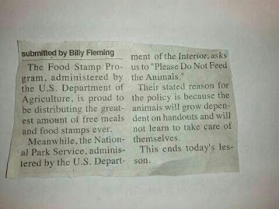
Of course the point of the post is to make the comparison between the dependency of animals on the humans that feed them and the dependency of humans on the government that feeds them (though the intent is probably to attack government dependence in general and not just the food stamp program).
The question is whether such a comparison is reasonable? This is where I think most people fall prey to the cognitive bias known as the false dilemma (black & white thinking). They believe that the comparison has to be either all true or not true at all. From there, throw in a little confirmation bias to see what we want to see and voila, we have a one sided way of looking at a situation.
Of course some people will become dependent on government programs to their own detriment. Others will not. Of course some people really are in desperate need of help while others only lazily take advantage of such programs. Unless you have restricted yourself to knowing only a small social, ethnic, economic portion of the population you will have met people of differing levels of motivation, intelligence, creativity, morality, etc. My point is simply this. Humans are complicated creatures and usually our overly simplistic heuristics are not suited to answer deep questions about such things.
Monday, April 30, 2012
Separated at the 38th Parallel
As I mentioned in a prior post I have been reading Why Nations Fail by Daron Acemoglu and James Robinson. The following is an interesting story from the book which further shows the difference political institutions can make in the prosperity of a nation.
"In the summer of 1945, as the Second World War was drawing to a close, the Japanese colony in Korea began to collapse. Within a month of Japan's August 15 unconditional surrender, Korea was divided at the 38th parallel into two spheres of influence. The South was administered by the United States. The North, by Russia. The uneasy peace of the cold war was shattered in June 1950 when the North Korean army invaded the South...It was then that Hwang Pyong-Won and his brother were separated...Dragged apart in 1950, they met again in 2000 in Seoul for the first time in fifty years after the two governments finally agreed to initiate a limited program of family reunification.
As a doctor, Hwang Pyong-Won's brother had ended up working for the air force, a good job in a military dictatorship. But even those with privileges in North Korea don't do that well. When the brothers met, Hwang Pyong-Won asked about how life was north of the 38th parallel. He had a car, but his brother didn't. "Do you have a telephone?" he asked his brother. "No," said his brother. "My daughter who works at the Foreign Ministry, has a phone, but if you don't know the code you can't call." Hwang Pyong-Won recalled how all the people from the North at the reunion were asking for money, so he offered some to his brother. But his brother said, "If I go back with money the government will say, 'Give that money to us,' so keep it." Hwang Pyong-Won noticed his brother's coat was threadbare: "Take off that coat and leave it, and when you go back wear this one," he suggested. "I can't do that," his brother replied. "This is just borrowed from the government to come here." Hwang Pyong-Won recalled how when they parted, his brother was ill at ease and always nervous as though someone were listening. He was poorer than Hwang Pyong-Won imagined. His brother said he lived well, but Hwang Pyong-Won thought he looked awful and was thin as a rake."
Monday, April 23, 2012
North Korea in the dark
I have been reading Why Nations Fail by Daron Acemoglu and James Robinson. The central premise of the book is that political institutions are the primary determinant of whether a nation will be prosperous or poor. Anyway, I came across a picture in the book of North & South Korea at night which helps demonstrate the sharp contrast between the two countries. I had seen such pictures before but thought it was interesting enough to make it into a post.
The image below was taken from GlobalSecurity.org

The image below was taken from GlobalSecurity.org

Friday, February 17, 2012
Fiddling as Rome burns: Federal Debt
I am sure that most have seen the images of Greece ablaze after the passing of the newest austerity package. The depictions of a developed European state quickly falling to the level of a third world country is quite sobering.
Though there are a number of things which caused the crisis, for the most part it can be quickly summed up with three simple words: too much debt. Too much spending and borrowing for too many years have caused this terrible crisis. It seems so strange that those in charge could not have seen this coming. I mean, it is a pretty simple concept. If you borrow too much, your creditors are going to start seeing you as a riskier bet, and as a result they are going to increase the interest rates they charge you for any future loans to help compensate them for that increased risk. This is what happened to Greece. Of course the problem is that Greece is already maxed out and can't even afford to maintain its current debt load, much less handle the increased rates on any new borrowings.
Though the Greek situation is tragic, you would think that it would at least be a wake up call for us here in the good old US of A. Well, apparently not. Recently congress passed the payroll tax cut extension thus keeping the Social Security withholding rate at 4.2% for the rest of 2012. This is a tax cut for a program which is now paying out more in benefits than it takes in from withholding tax. Of course congress is not going to do anything to reduce the benefits the program pays out, so where is the money going to come from? Well for most of Social Securities history it actually took in more than it paid out but instead of putting that money aside, the government spend it on other things and left Social Security with a bunch of IOU's in the form of government bonds. Well, I guess that they will have to cash in those bonds which means that the federal government will have to take the money out of another pocket. This essentially means that it will just be another thing to help keep our enormous deficit spending going.
Now I'm not suggesting that we are in quite as bad of shape as Greece is. But I do have to wonder if our politicians will have the political will to really deal with the federal debt before it is too late.
Monday, January 16, 2012
Make mine liberty 1948
Produced by Harding University in 1948 in it's efforts to counter the appeal of communism.
Tuesday, January 10, 2012
Fairness?

A friend of mine posted this on his facebook page. I thought my response might be too long so I am making it into a blog entry.
The first thing that jumps out at me is the obvious cherry picking going on. The chart seems to indicate the average salaries of the fire fighter, teacher, police officer and doctor but then instead of using the average salary of all hedge fund managers it only looks at the salary of the top 25. I have no idea how many hedge fund managers there are but after doing a quick Google search I found this list you can purchase from BarcayHedge which says it tracks 23,700 different funds. Of course the people who mad the chart know this but they were skewing the numbers on purpose to try and illicit a stronger emotional response from people.
The second thing that comes to mind is the response people seem to have to this sort of thing, which is that 'the government needs to do something about this' and 'that's not fair, where is my piece of the pie'. I think it is important to step back and remember why these people are able to make the kind of money that they do. In my mind it is due to the basic constitutional rights to life, liberty and property within the framework of a (semi) free market economy. It is our system of property rights and freedom which not only enables some to become incredibly wealthy but also allows our standard of living to be one of the highest in the world. Here is a link to the Wikipedia article on GDP per capita. As you can see it places the US at number 7 per the International Monetary Fund and the World Bank.
To sum it up, my concern is that the more people start to see the economy as a giant pie that the government can slice up and hand out to people, the more power we give them to do so and the more reliant upon it we become. There is also an argument to be made for spontaneous order through the free market being superior to that of a centrally controlled economy but I don't have the time to get into it. Here is a video I found that touches on it.
Subscribe to:
Posts (Atom)